Sternwheeler getting some Yukoners steamed
A well designed and executed logo should say a lot about a community, and residents have every right to take it personally. The design that was chosen to “re-brand” Whitehorse recently has a lot of people upset, both because it’s a very poor design (in my opinion), and because many of us didn’t even know such a thing was being considered.
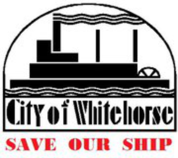
This is the current logo used by the City of Whitehorse. It’s simple and it’s distinctive. Sternwheelers were significant in the history of the Yukon and of Whitehorse in particular, and the restored sternwheeler SS Klondike is an iconic attraction for visitors.
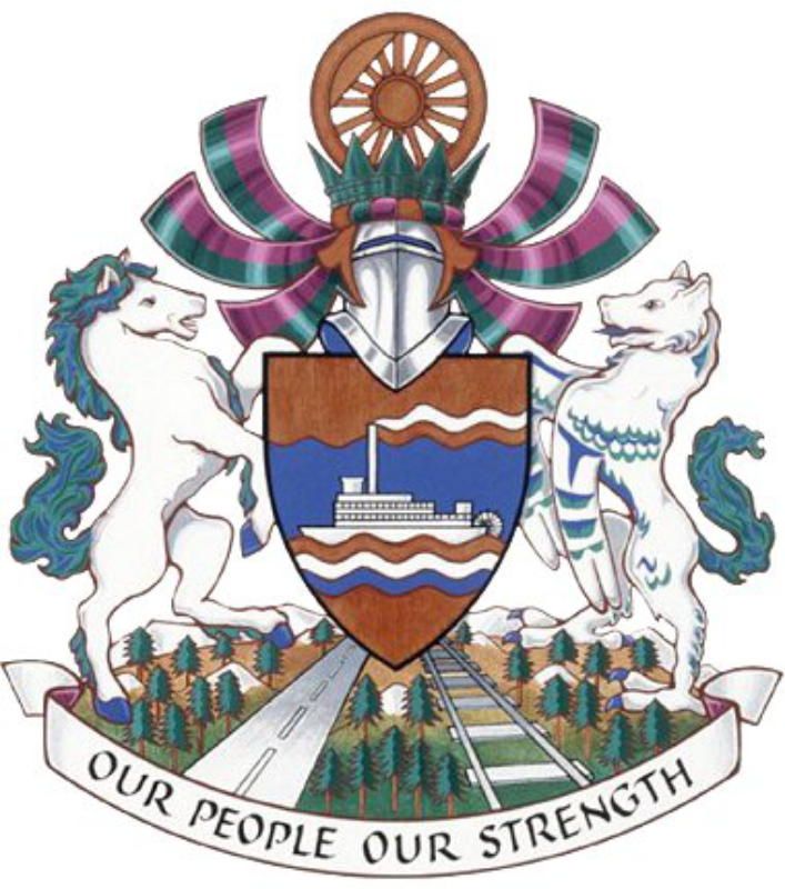
The city’s coat of arms re-affirms the significance of the sternwheeler.
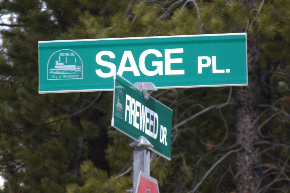
The sternwheeler logo has been used extensively around the city for decades (since the 1970s, I believe). It’s used on street signs…
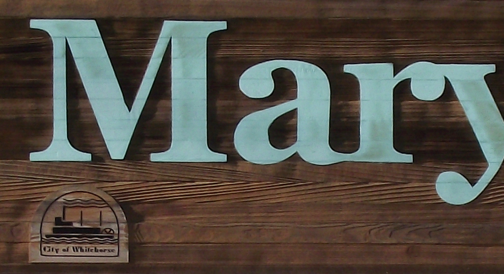
… on community signs – the Mary Lake sign has the logo sandblasted into the wood…
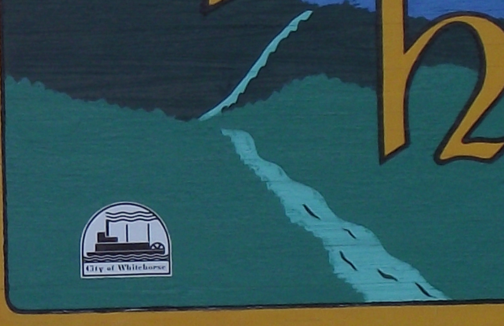
…while the Spruce Hill sign just has a decal of the logo.
It’s also used on all manner of city vehicles and other signs. It is, however, noticeable by its absence on the City’s very bland web site.
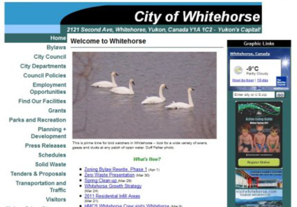
On the city’s tourism web site, only a tiny version of it can be seen at the upper right.
Six days ago, I was made aware of the fact that City Council wants to scrap the sternwheeler in favour of a modernistic horse head designed by a company in Ontario. An article in The Whitehorse Star (now gone from the website) described the efforts of Vanessa Brault to halt the process until residents have been given a proper chance to have input.
A Facebook page (now gone) has been set up to support the opposition to the change.
Whitehorse Mayor Bev Buckway stated on the radio a couple of days ago that she’s tired of people not objecting until the last minute when the City decides to do things. The objections are largely based on the fact that many of us who care about such things didn’t know about it.
The logo decision aside, when is the City responsible for ensuring that residents know when certain things are in progress, and when are residents responsible for finding out details of the City’s operations on their own? A survey was done as part of the re-branding study – the survey was advertised on radio and in newspapers, but many residents, including me, don’t listen to local stations (if you listened for 10 minutes you’d know why) nor I buy newspapers very often. Using 1950s technology to advertise a process intended to (among other things) show what a modern city Whitehorse is seems odd.
eSolutions, the Ontario company that was paid $60,000 to come up with the new brand, had this to say about what a brand is:
At the centre of a brand is the core concept of what makes something – in this case, Whitehorse – unique and valuable. What is it that separates Whitehorse from other cities? What is special about this place that instills pride among our residents? And what differentiates it from other communities with which we compete for residents, investors, businesses and tourists?
And they came up with A HORSE?!?! What on earth does a horse have to do with the community’s past, present or future other than being part of our name – and what is distinctive about it?