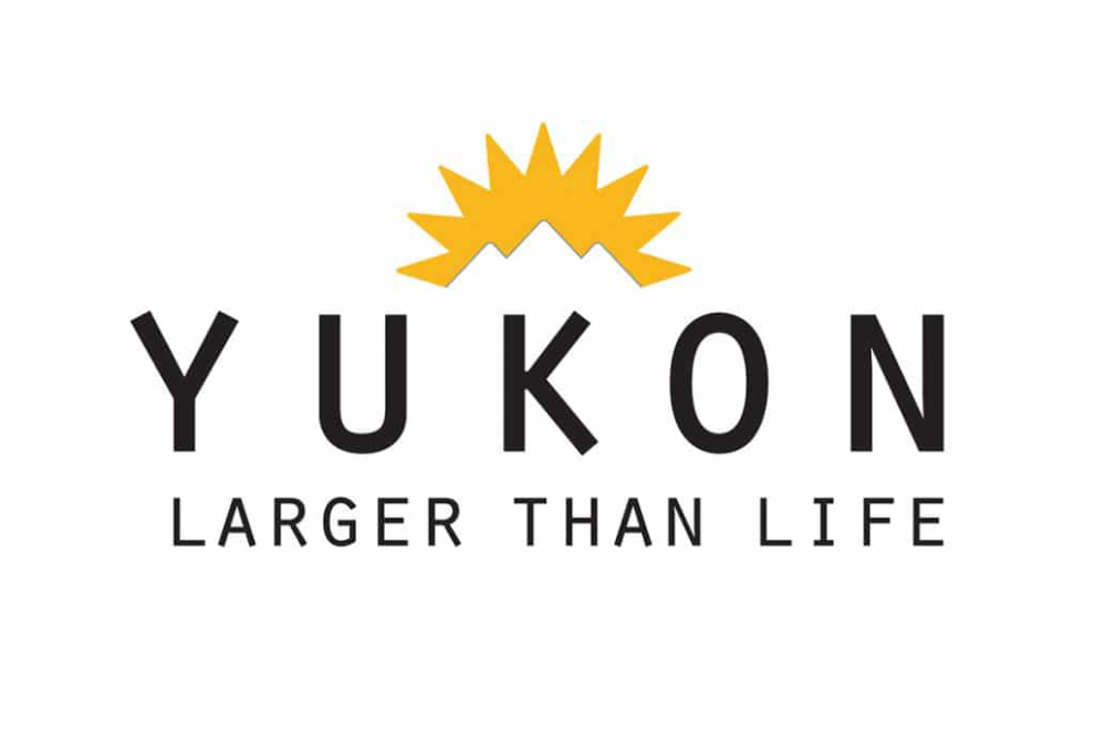
Error in Branding? “Yukon – Larger Than Life”
The folks at Yukon Tourism are in trouble again – this time, it’s about the new Yukon logo and slogan seen to the right. Over the past year or so I’ve filled out 2 long surveys supposedly about what direction our identity branding should go, but the last one, which introduced several variations on the one chosen, only allowed comments on the variations, not a comment that they should start over. It just reminds me of a Sunkist orange logo – I don’t have a problem with “Larger Than Life,” but the text is barely legible. It is FAR better than the last disaster, “Canada’s True North,” which Yukoners hated – I just found it insulting (if we’re Canada’s True North, what, pray tell, are the NWT and Nunavut???).
Launching the new slogan has cost $200,000 – and now they have hundreds of signs to change along the highways. They could spend $5 million dollars and not come up with a slogan as good as the one that served us well from 1986 until 1999 – “Yukon – the Magic & the Mystery.” I’ve always considered that to be the most evocative tourism slogan I’ve ever seen. However, when Susan Shewan was living in the Yukon in 1977-78, she wrote a song called “Yukon Magic & Mystery,” and sued the Yukon government over use of the phrase. Although she lost the case, the slogan was replaced shortly after anyway (the logo of the time, of Klondikers climbing the Chilkoot, was far more distinctive than our new “Sunkist sun”, too).

In Alaska, Ketchikan recently changed their slogan from “Alaska’s First City” to “Our Lifestyle, Your Reward” (I think that’s excellent), and Anchorage is currently going through the process of finding a new one.
This blog looks like I have my own error in branding going on now (with non-Northern pictures), but if I stick with this design, they’ll all be changed. This is basically the look I want, but I’ll give this design a week or so to see if I still like it.